Appalachian Trail Conservancy Rebrand + Logo Design
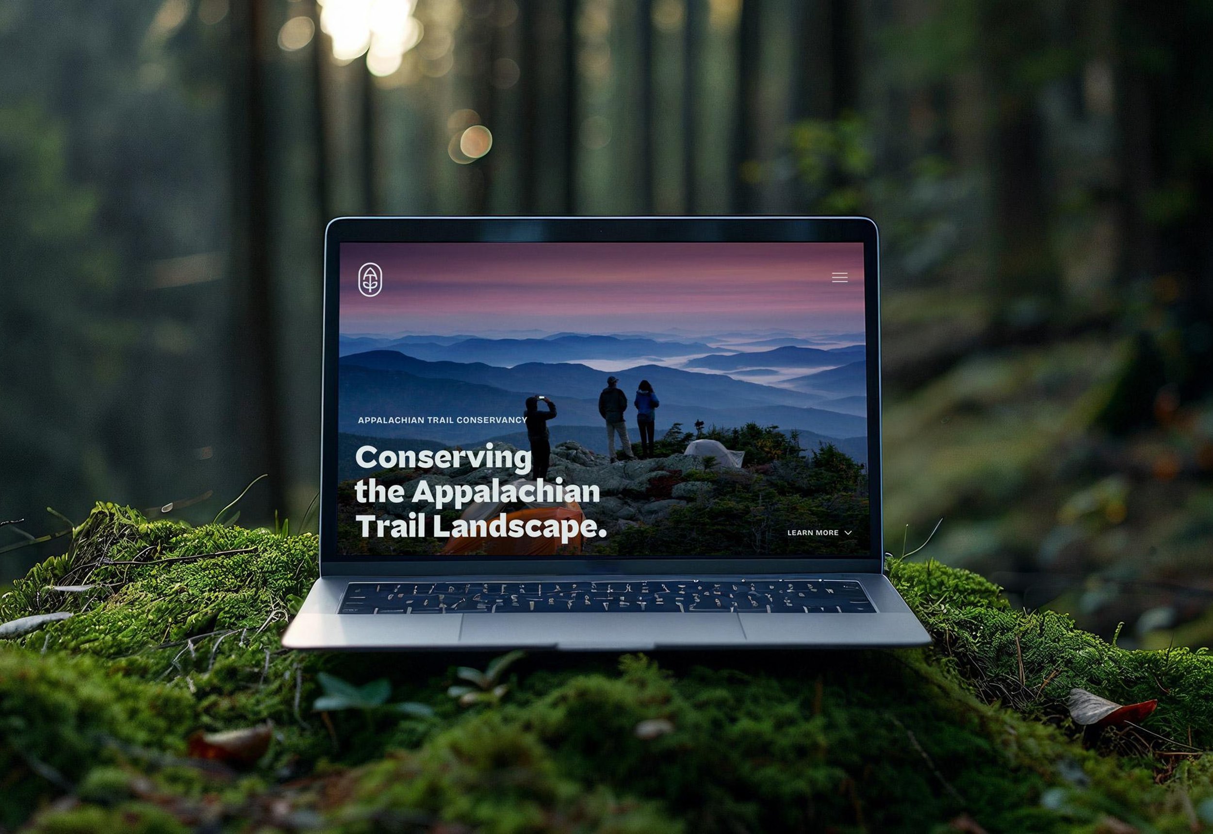
The Appalachian Trail Conservancy (ATC) needed a brand refresh to reignite donor support and bring visibility to the often-overlooked organization behind the country’s most iconic trail.
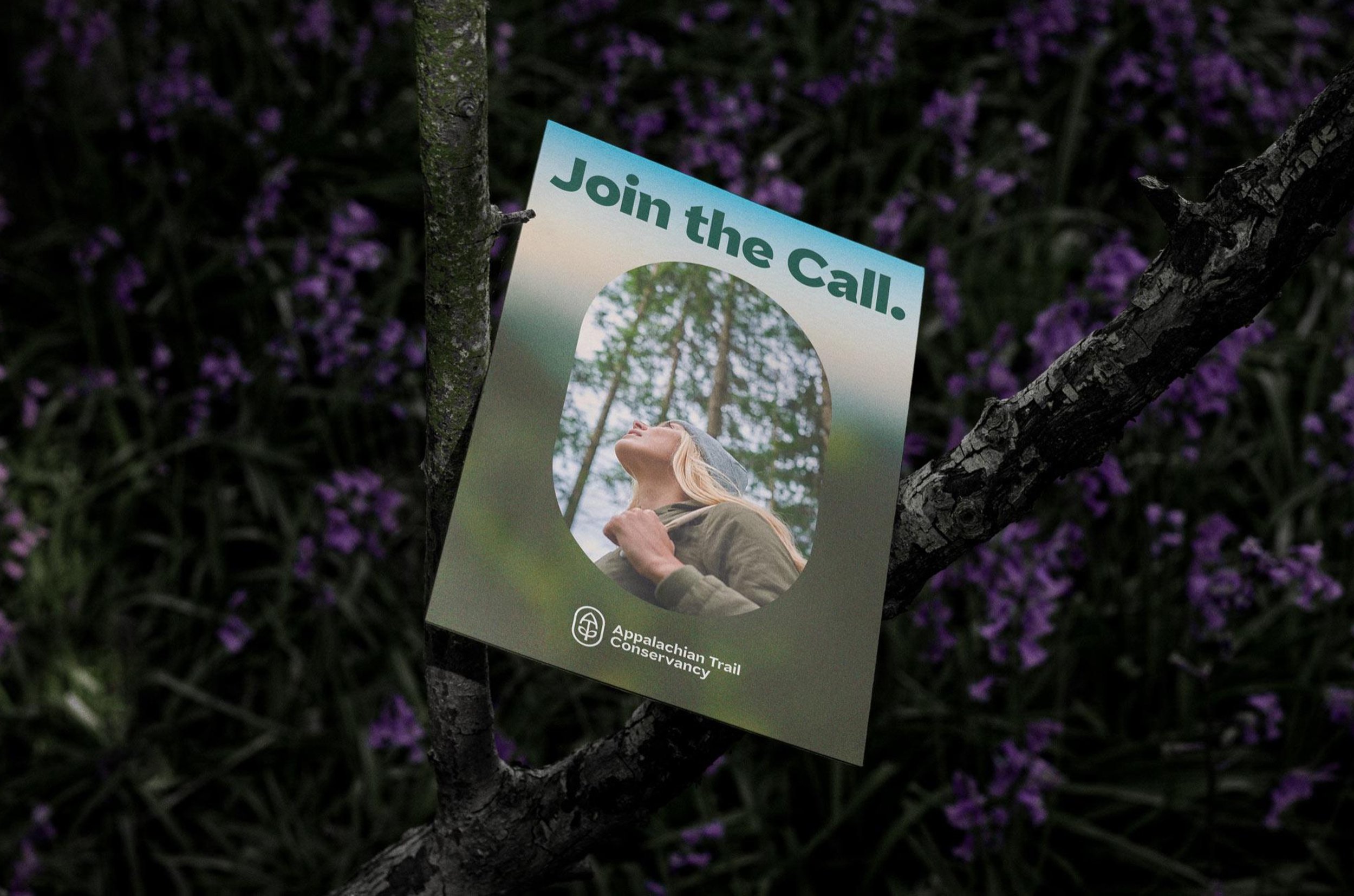
The refreshed brand drove a 25% increase in donations YoY and powered the Take a Hike campaign starring SNL alum Kevin Nealon.
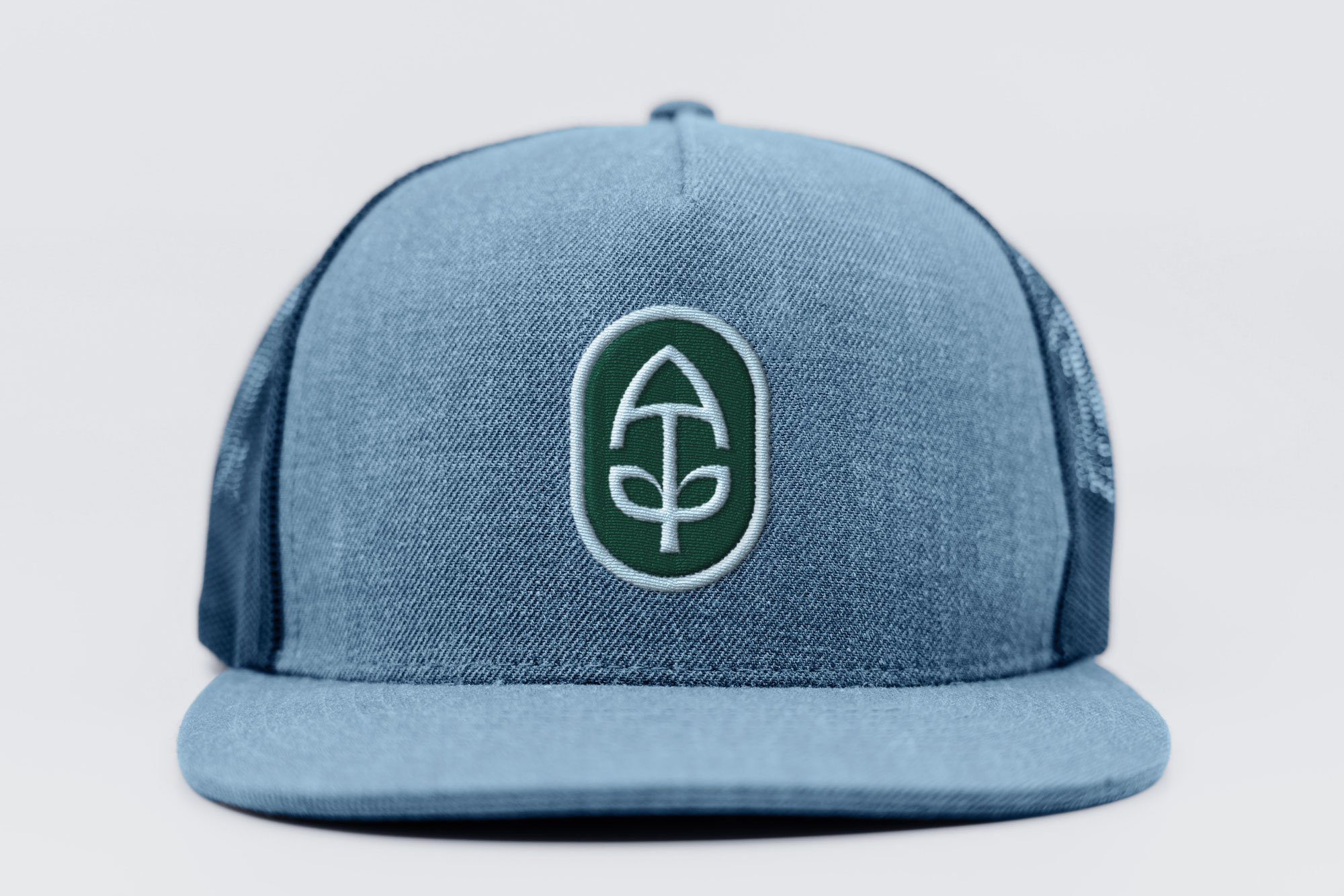
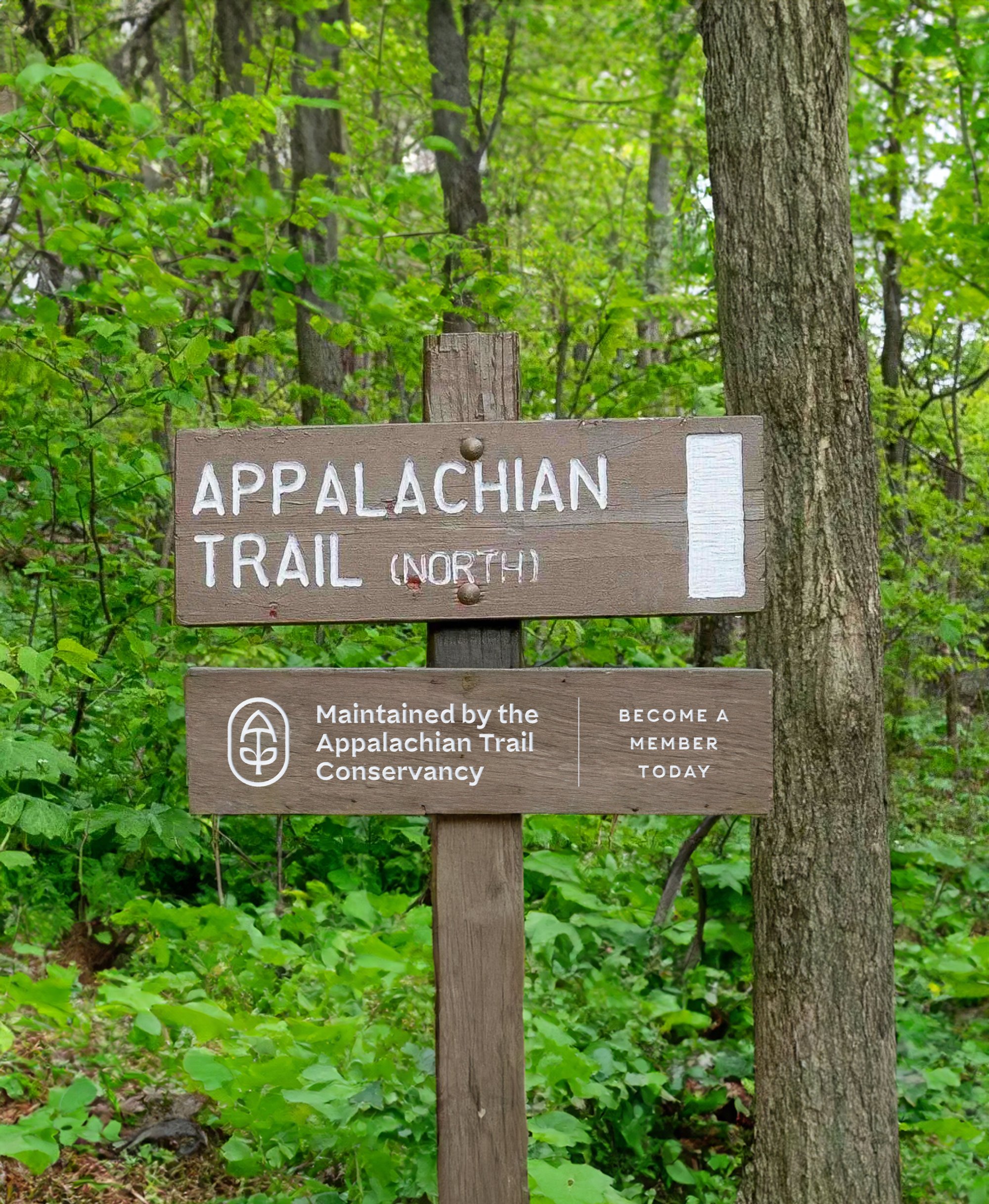
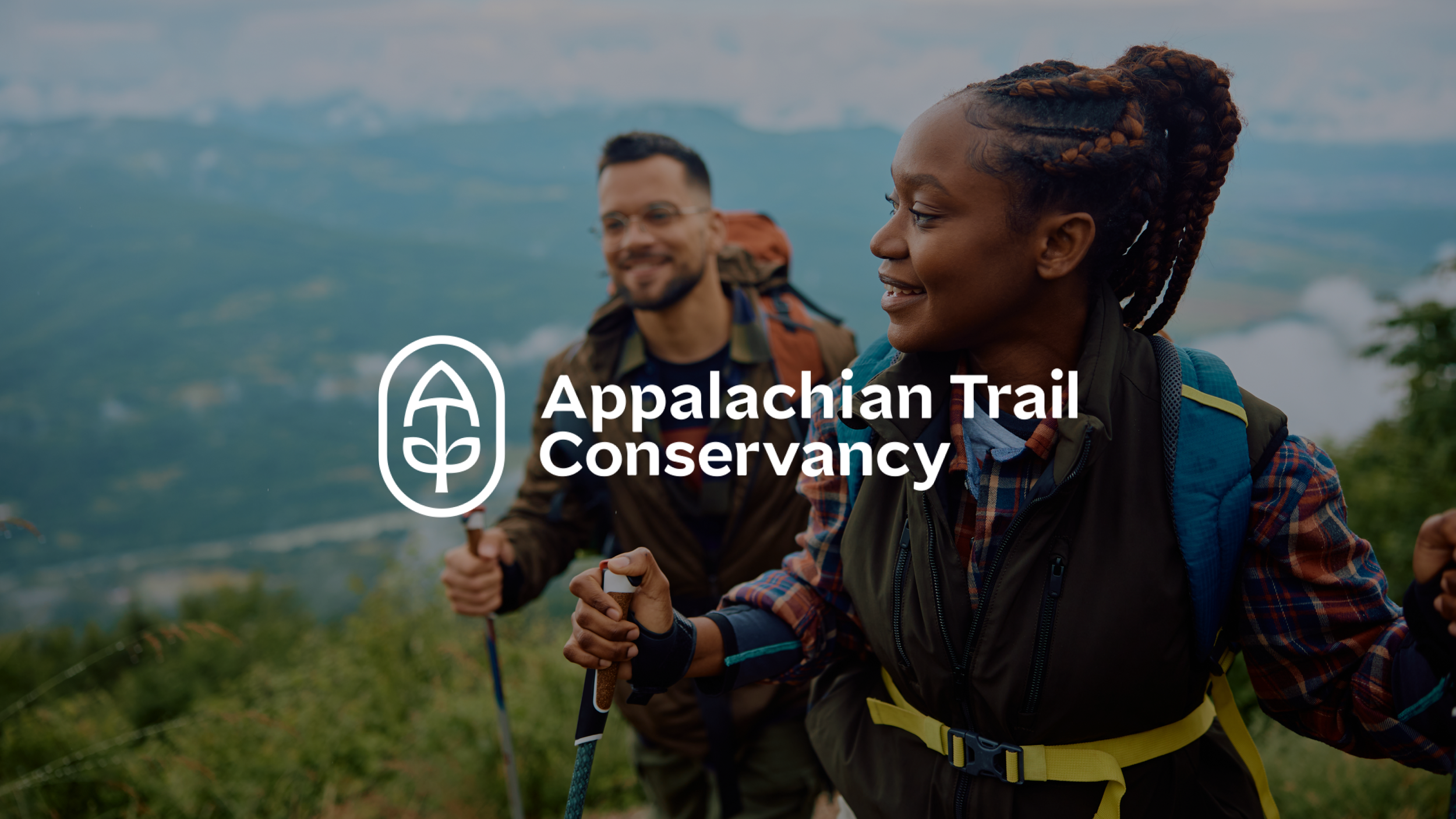
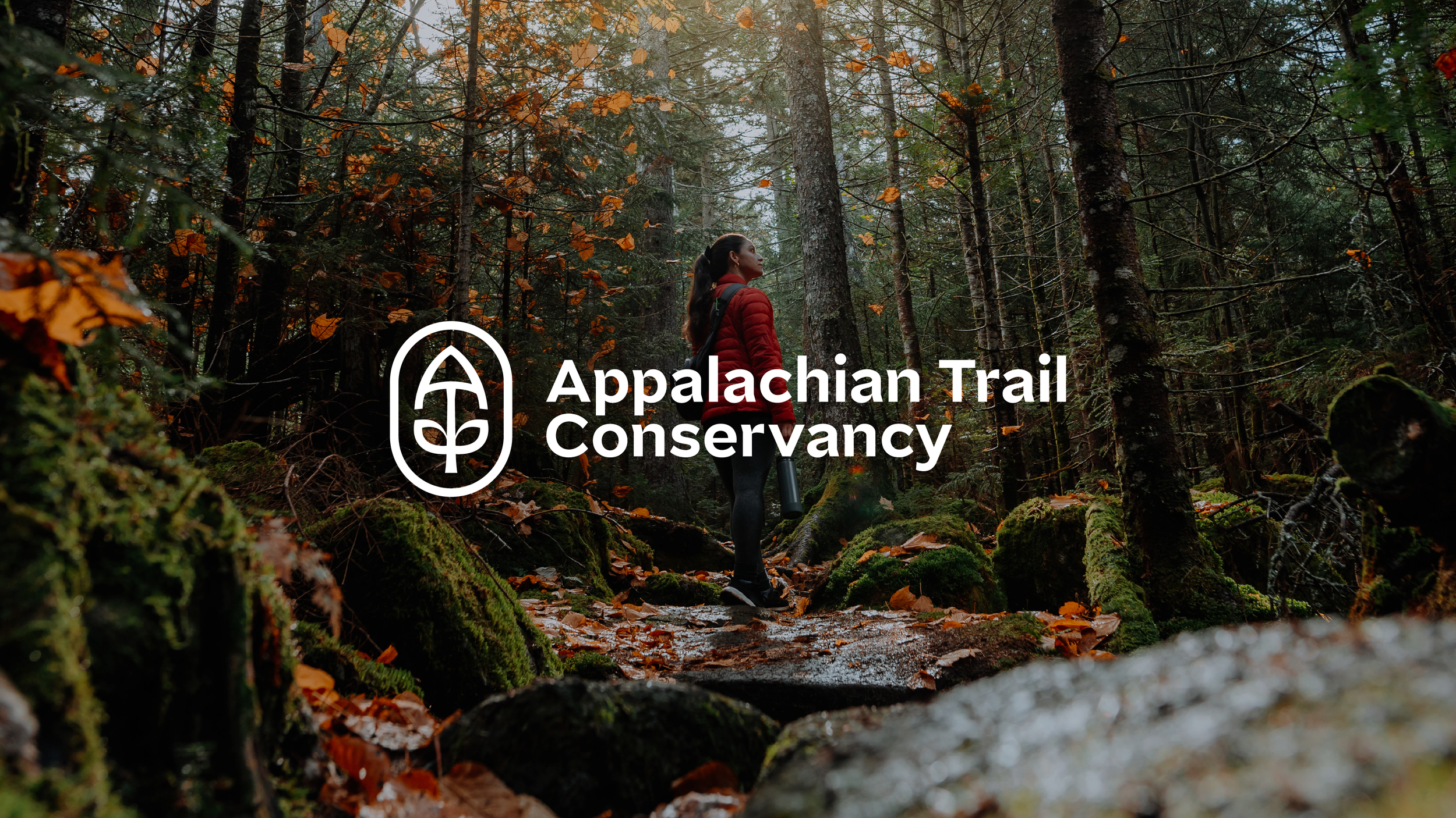
I developed a new logo and identity system designed to stand out in today’s brand landscape — anchored by the rallying cry to Keep the Trail Alive. The result is a more engaging, human-centered brand that meets people where they are: on the Trail and beyond.
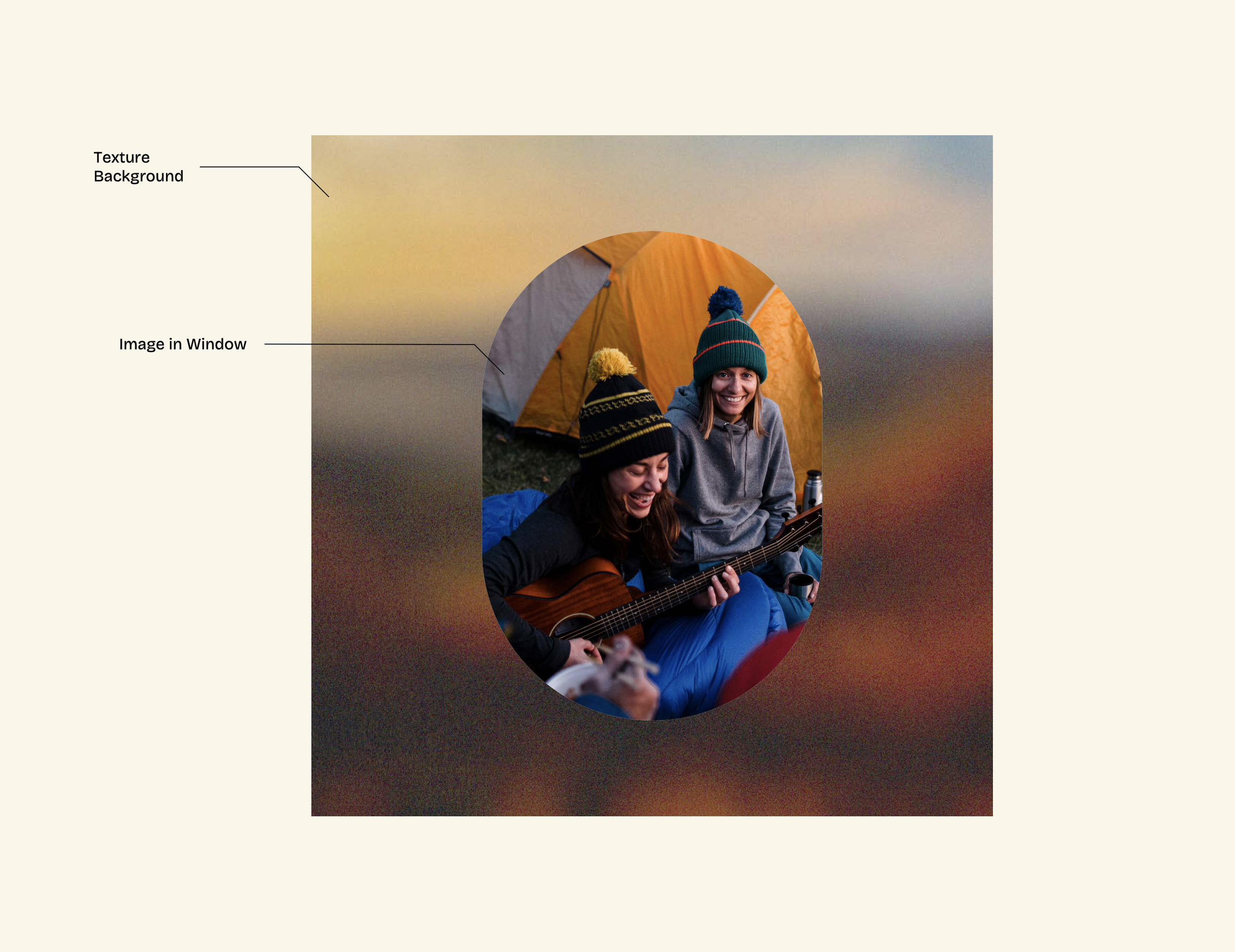
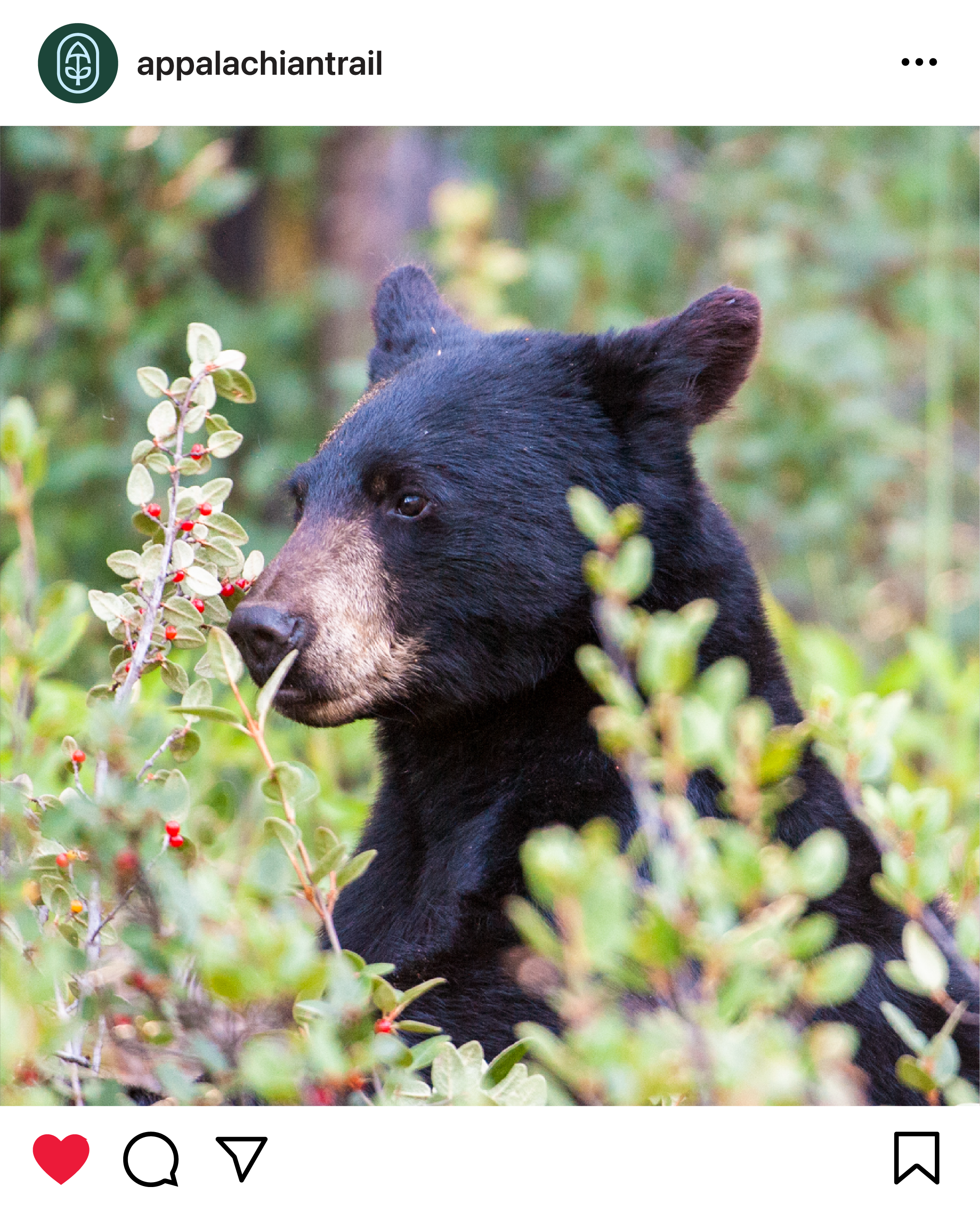
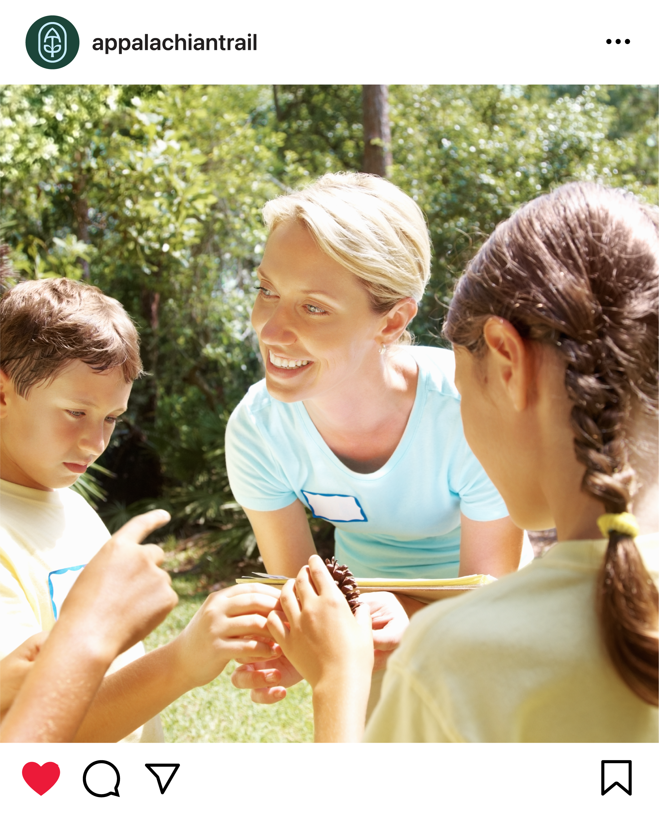
We also reimagined ATC’s photography approach: capturing the full spectrum of the Trail, from biodiversity and wildlife to sweeping vistas and human connection. The system turns real moments into storytelling, bringing the magic of the A.T. to life.
Client: Appalachian Trail Conservancy
Services: Logo + Identity + Brand Guidelines
Design: Amy Borg
Copywriting: Amy Borg
Creative Oversight: Noah Mooney
Year: 2025


Tagline Treatment

Photography


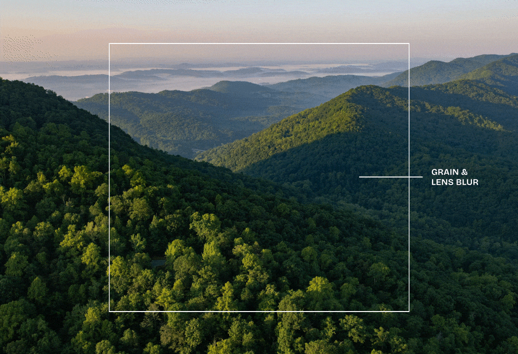
Process Demo — Brand Texture

Brand Texture — Spring Landscape

Brand Texture — Fall Foliage

Brand Texture — Dawn Horizon

Brand Texture — Blue Ridge Vista